LOKID

Empathize
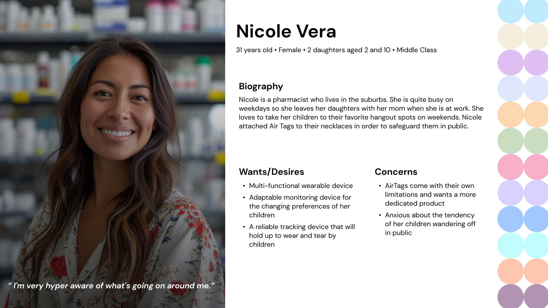
I conducted interviews, created empathy maps and user journeys in order to understand and empathize with parents and children. The primary user groups identified through these interviews are parents with young children.
During my primary research, I realized that a lot of parents use Air Tags as a safety product for their children but feel frustrated over the limitations due to the product being created for object tracking purposes.
At this stage, I finalized my main idea of designing a discreet wearable product by children and a companion app on the parents' phones.
Ideate
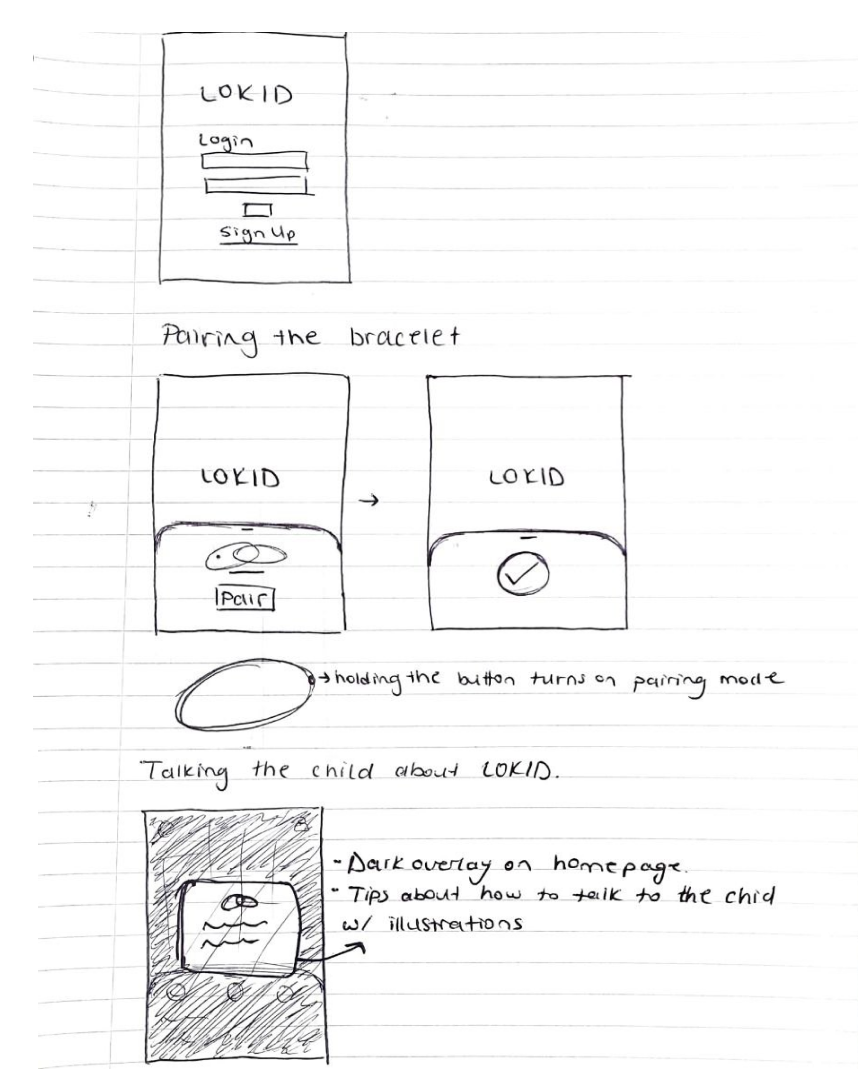
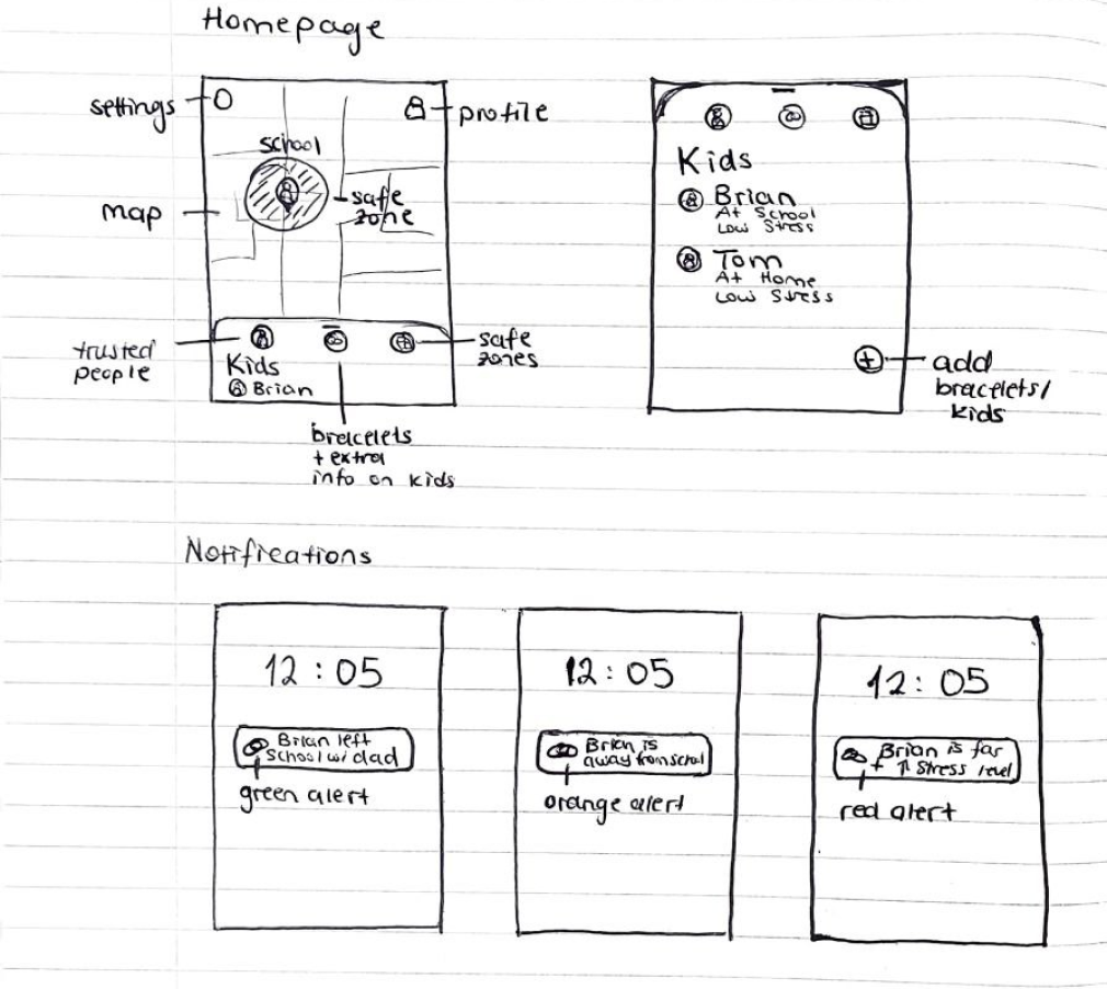
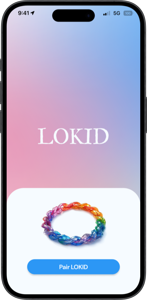
My goal is always to make sure the on-boarding process is intuitive as it's the first impression the user will have of the product. I wanted to imitate how Air Pods pair to iPhones with my bracelet pairing process.
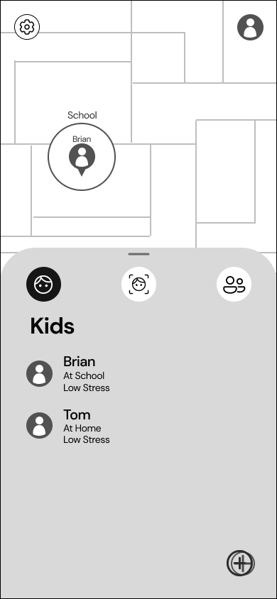
I started my wireframing process by sketching our different ideas for the different screens I needed for my core features. This process helped me explore different designs and improve on them before I moved on to Figma to create the digital versions.
I kept iterating on my low fidelity mockups to achieve the best possible solution I could create within the limited time frame I had, and moved on to creating high fidelity mockups.


Prototype
After iterating on the low-fidelity prototype based on peer feedback, I started working on my high-fidelity prototype. I kept iterating on the design based on feedback until I had to start conducting my user testing.
The mockup pictures on the left are post usability test to showcase the last version of my design.
You can click the "Prototype Link" below to view the prototype.
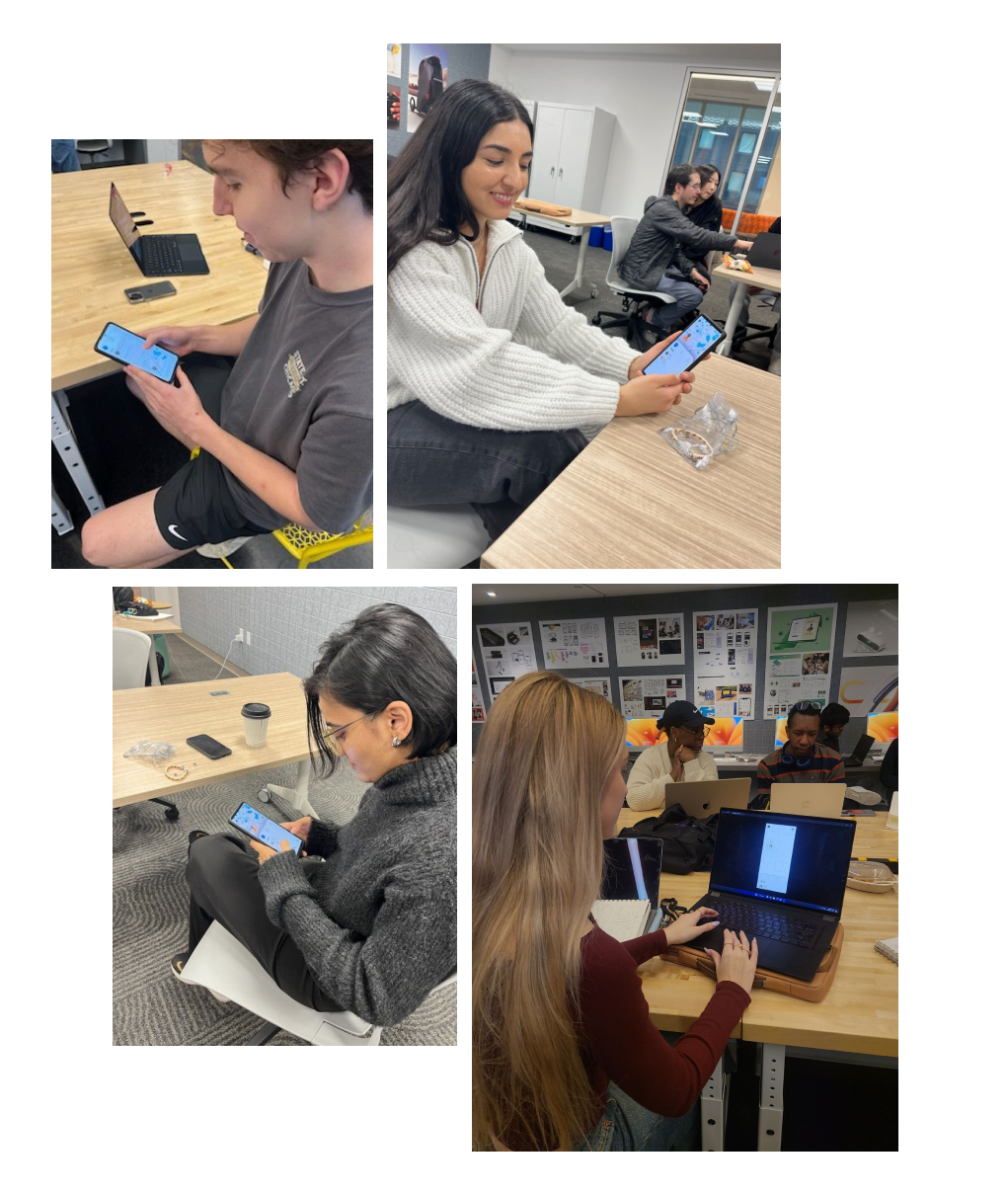
Usability Test
I conducted my usability test with industry professionals, upper classmen, peer and also contacted parents to test LOKID.
I had a peer take notes while I conducted the tests to make sure I didn't miss any useful feedback or observations that would later be my guide as I kept on iterating and improving my design.
The key insights I gathered from the usability tests were: the buttons and containers were too small, some placements and the type of iconography used was not intuitive, users wanted to see more features and the steps in my core features weren't very efficient.
I worked on my mockups and improved them. The UI pictures above with the prototype is the last version of my work, which I will continue to iterate on.
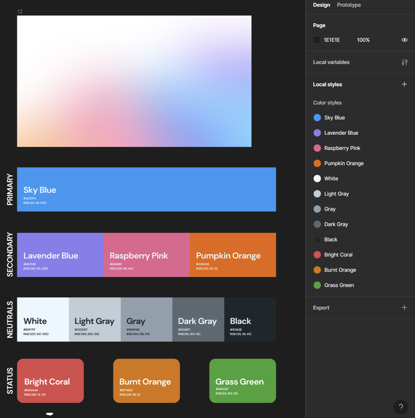
Color System
I created a color system before I started creating my high-fidelity mockups. I wanted to use blue as my primary color to create a sense of trust for parents, as this is a child safety product.
I also wanted to create a playful palette of secondary colors to keep the children in the equation. LOKID will be used by parents, but the aim is to protect children.
Moreover, I worked on all color combinations to ensure they pass the WCAG AA and AAA guidelines.
Conclusion
LOKID was a project I initiated during a UX course, where time constraints limited my design process. Despite this, I made significant progress but couldn't refine the design to my ideal standard before the course concluded.
Moving forward, I plan to independently pursue the project, starting with a new usability study on the updated user interfaces and creating a 3D model of the LOKID bracelet using Rhino. Ultimately, my goal is to enhance the prototype and user interaction, simulating a fully functional application.
Here's a link to a story of a mother using LOKID: