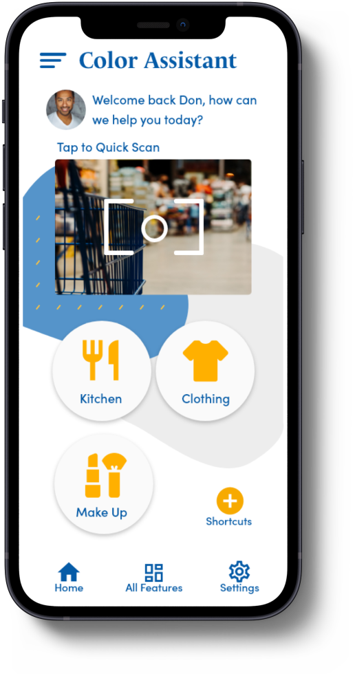
ColorCompanion

Empathize
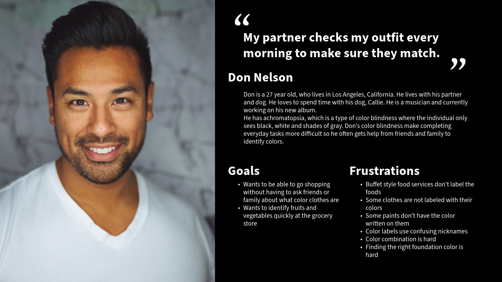
I started my user research by educating myself on color vision deficiency through various resources in order to prepare myself for the interviews. Next, I interviewed 5 color blind people and created empathy maps, personas, user journeys, and stories to be able to empathize with my target audience. I identified what the users need through these practices and the interviews.
Ideate
Due to my limited knowledge on the topic, I assumed that clothing was the only thing color blind people struggled with. After my user research, I realized that wasn’t the case and started working on my application ideas depending on the research findings.
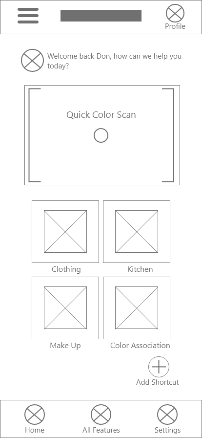
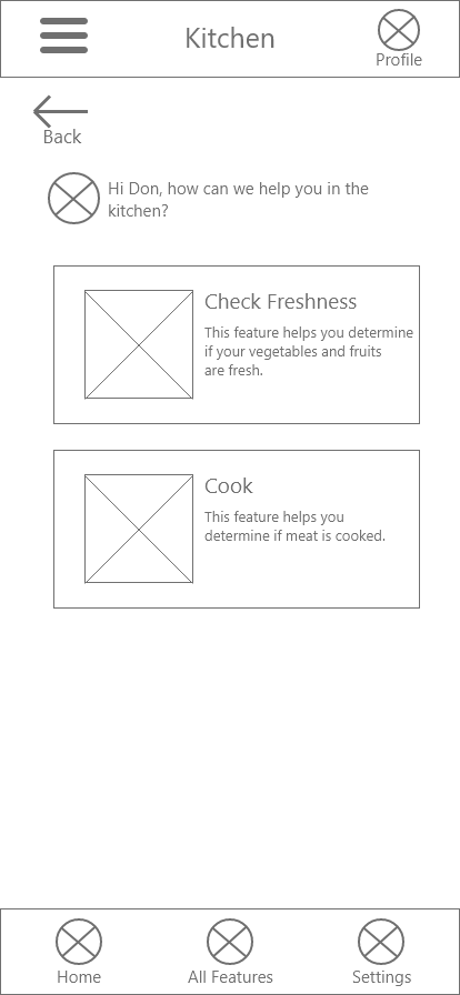
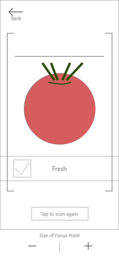
I conducted a competitive audit to understand what the other available apps lack and excel at. I sketched out my initial ideas, reviewed them, and turned them into digital wireframes.
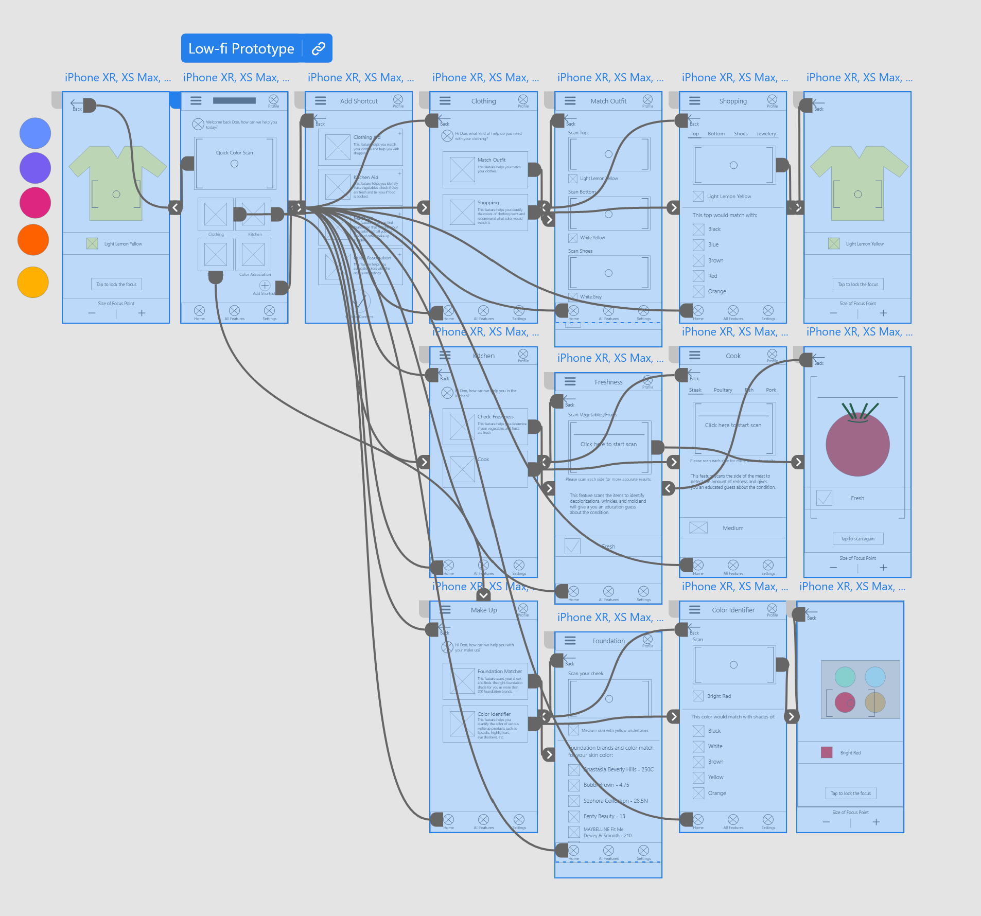
Prototype
I started working on my first usability study with the low fidelity prototype and tested out how useful each feature is.
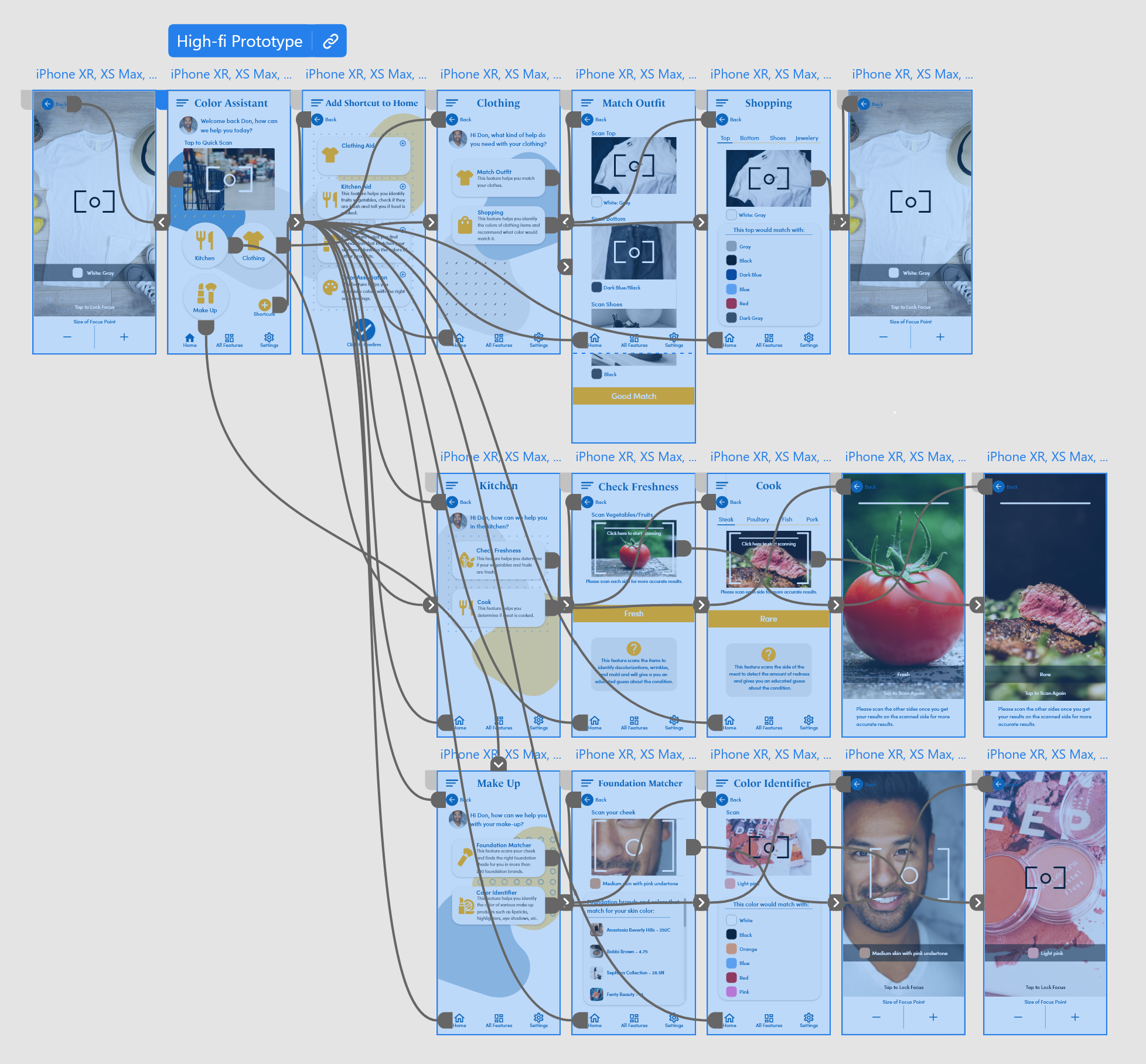
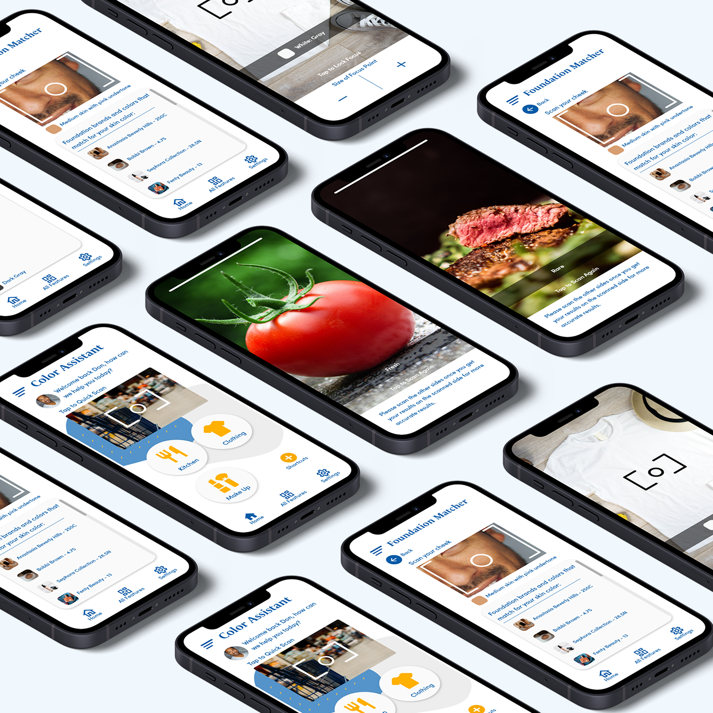
After my first usability study, I created the high fidelity prototype and conducted another round of usability study. The link is the final version of the prototype.
Test
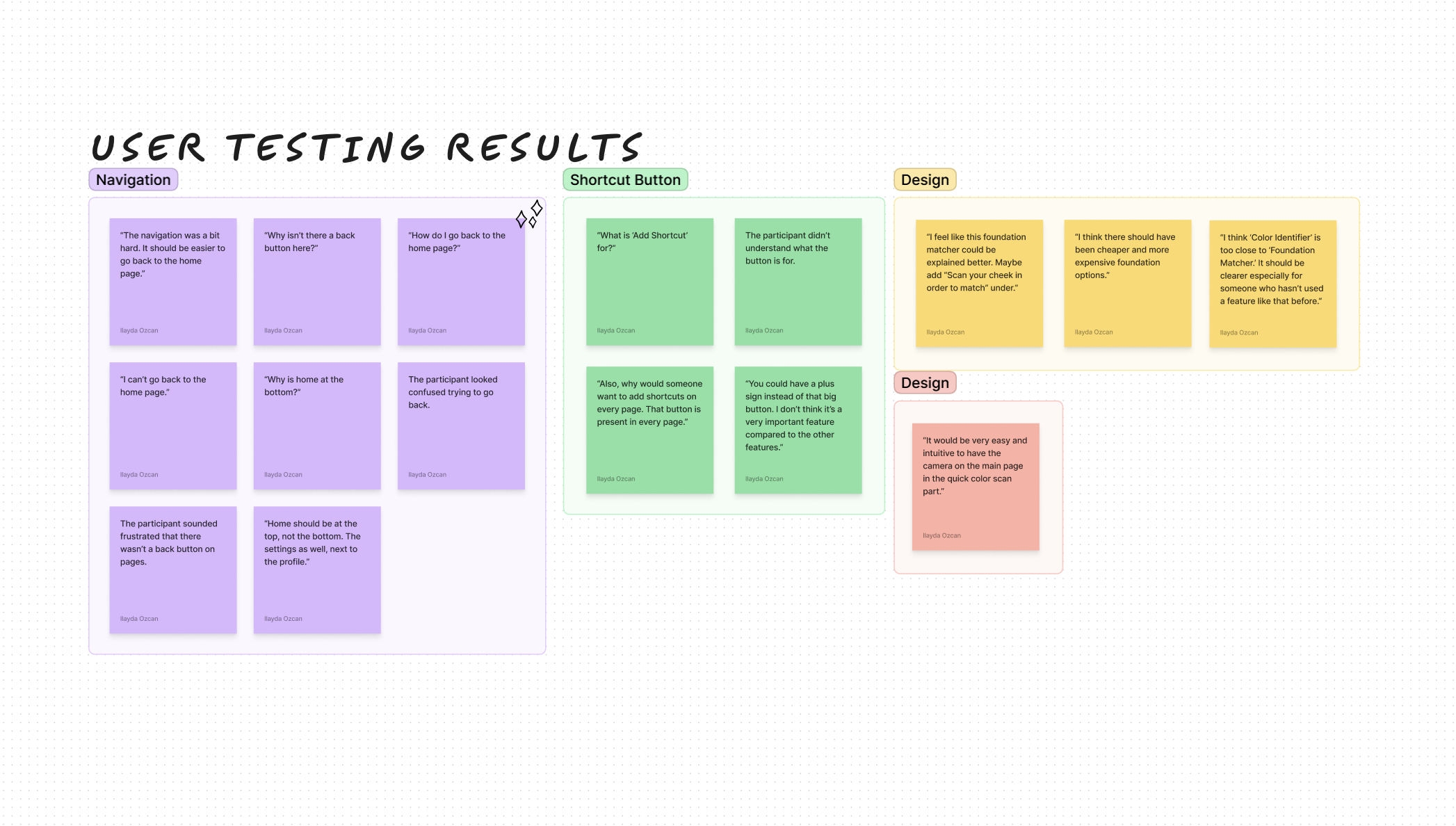
I conducted two rounds of usability tests with low and high-fidelity prototypes.
Findings:
- Navigation was confusing on some of the pages.
- The "Add Shortcut" feature was found to be not very useful and even confusing.
- Some users had trouble figuring out what exactly some features offer.
- Kitchen features were surprising and useful for some users.
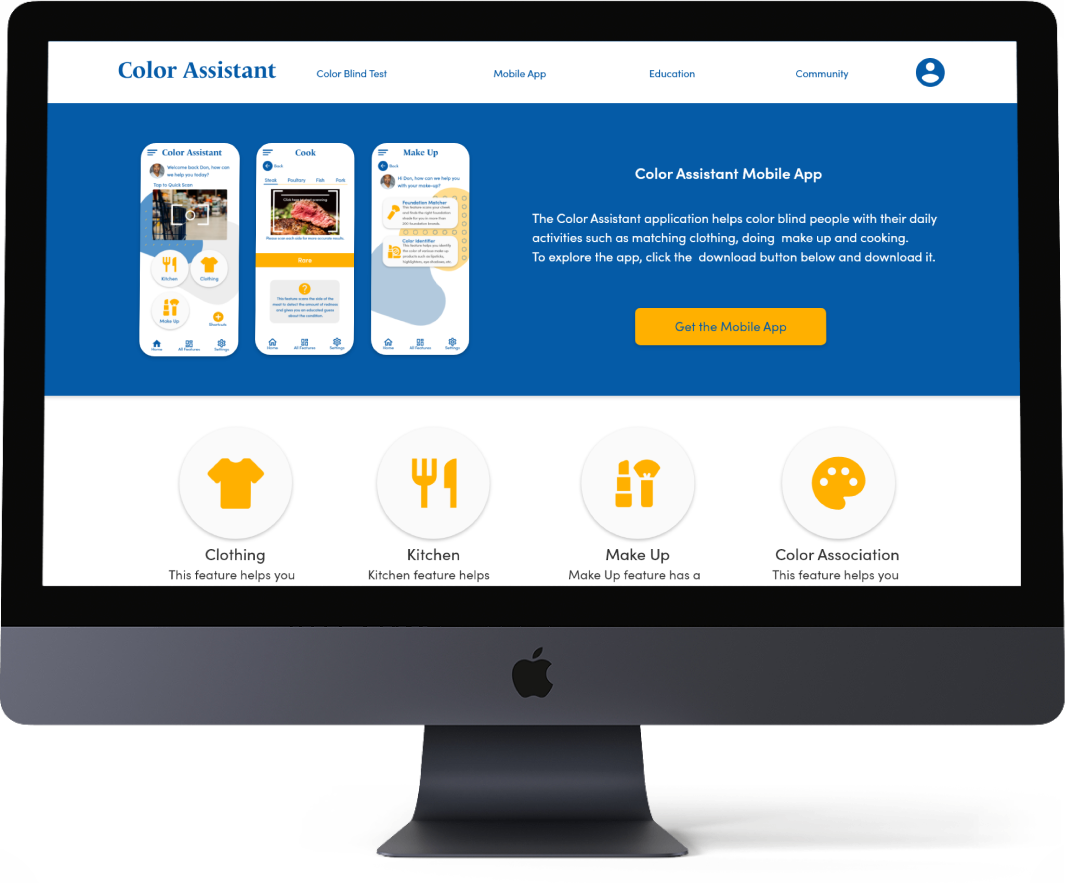
Responsive & Accessible Design
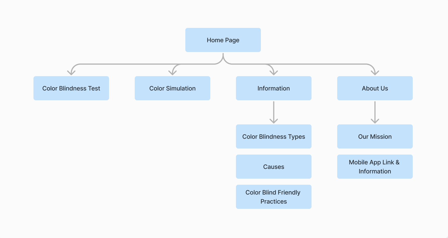
Site Map:
While I was designing the website, I've come to the conclusion that the mobile app features would not be very usable on the website.
Therefore, I decided to make it about color vision deficiency awareness, education, community, and the promotion of the Color Assistant application.
Considering the uses of each platform, I adjusted the screen content to enhance the user experience.
Accessibility Considerations in the App and Website:
• Color combinations in the app pass the WCAG AA and AAA guidelines.
• The website includes an optional, 2 question questionnaire to customize the colors and texts for the needs of the users.
• Iconography with labels was used. Hierarchy across pages achieved using headings and landmarks are used to map out the regions of the interface.
%20Mockup.png)
Conclusion
Color Assistant is the first application that includes numerous features in order to assist people with any kind of color vision deficiency. There isn’t much awareness going on about this topic and no reliable assistive technologies in the market. I believe that this application will benefit the CVD community.
I was unaware of how little I knew about CVD before I started this case study. It was a very educating journey for me to learn and hear about the experiences of the people of the community in order to create something that will help them. I learned a lot of color-blind friendly practices which will help me improve my future projects and make them accessible to more people.