Century Art Museum

Empathize
I conducted interviews, created empathy maps and user journeys in order to understand and empathize with the users I am designing for. The primary user groups identified through these interviews are adults between the ages of 30-49, people who are interested in arts, culture and history, education groups, families, tourists and historians.
Pain Points Identified:
Long lines, Confusing websites, Technical problems, Tickets running out quickly
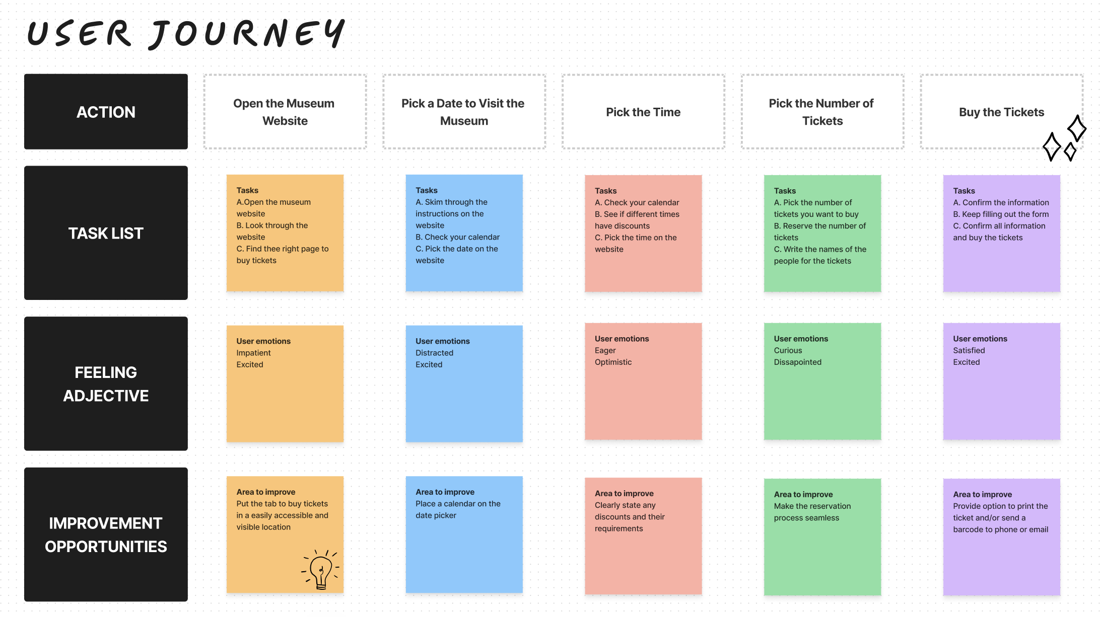
Ideate
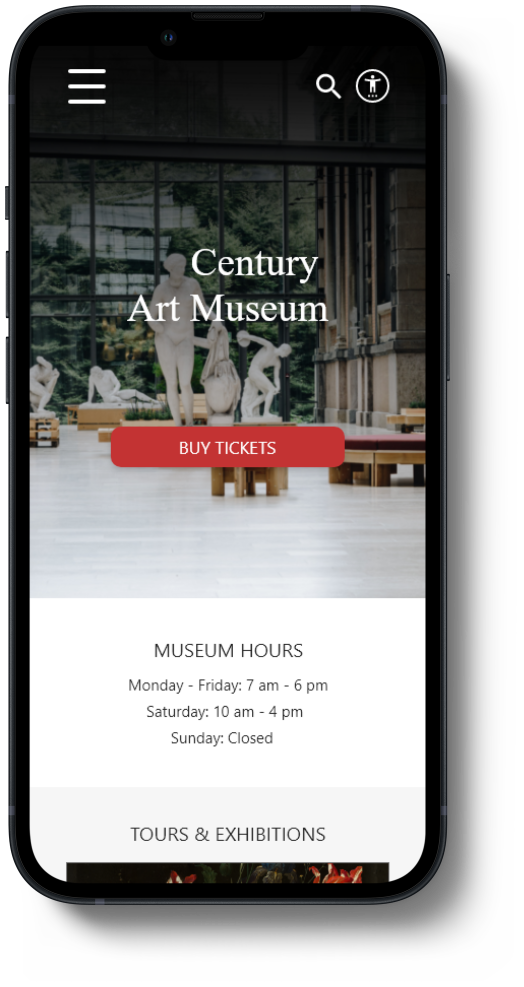
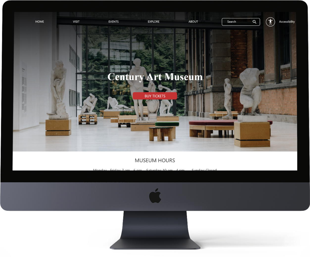
The goal is to have a website that is easy to navigate as much as possible and have the ticket buying option somewhere that is hard to miss to decrease the cognitive load of users.
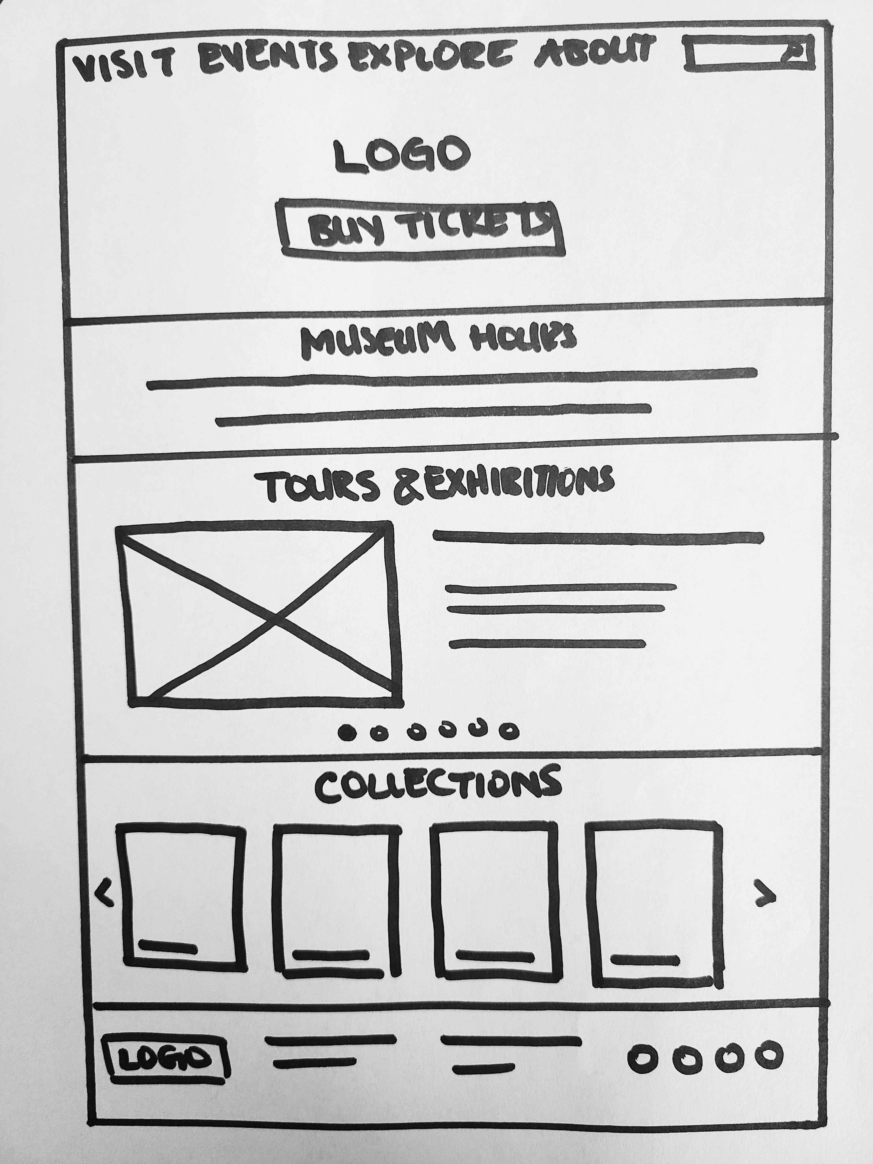
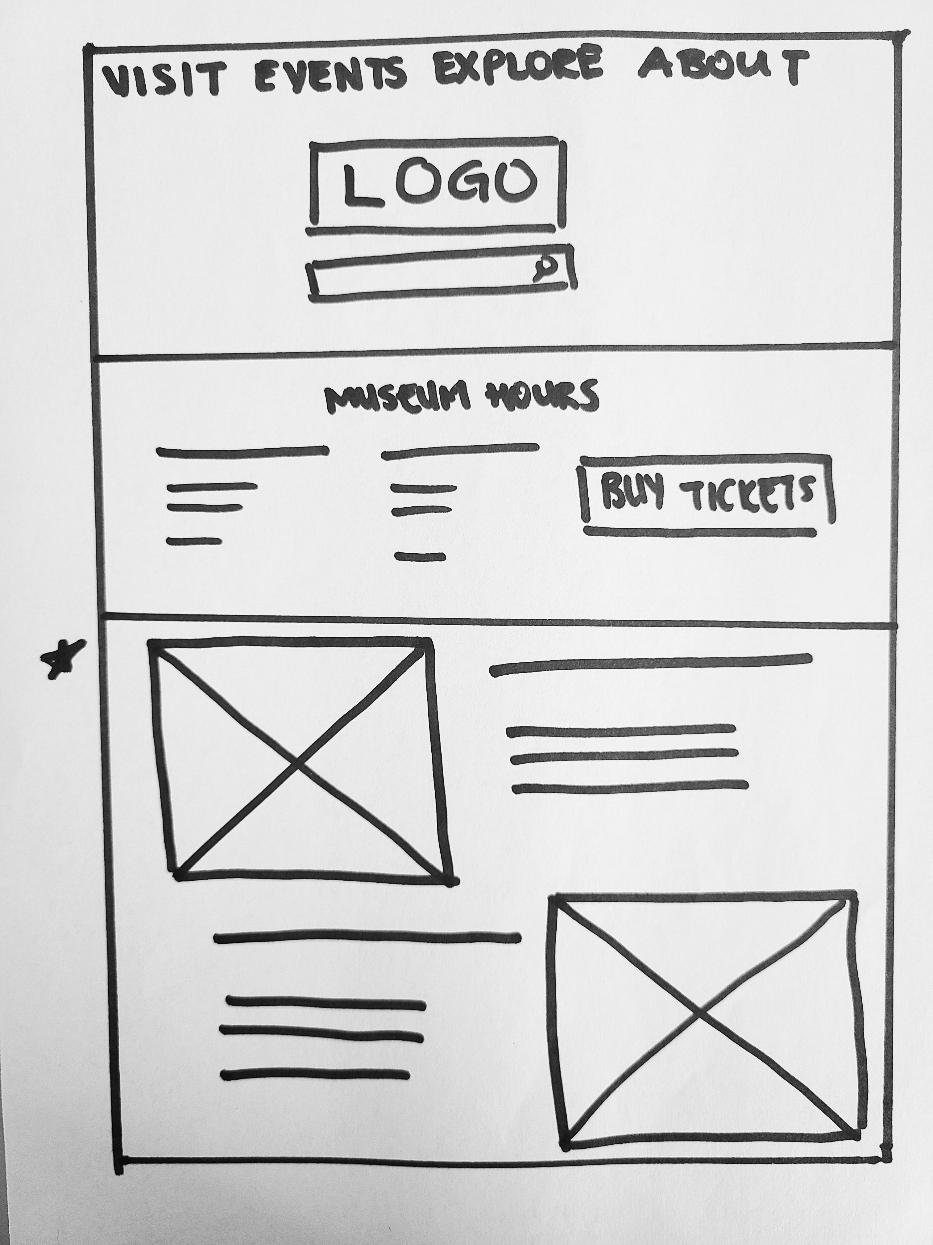
Ideating by drawing paper wireframes really helped me explore different solutions and combinations to achieve the most effective solution.
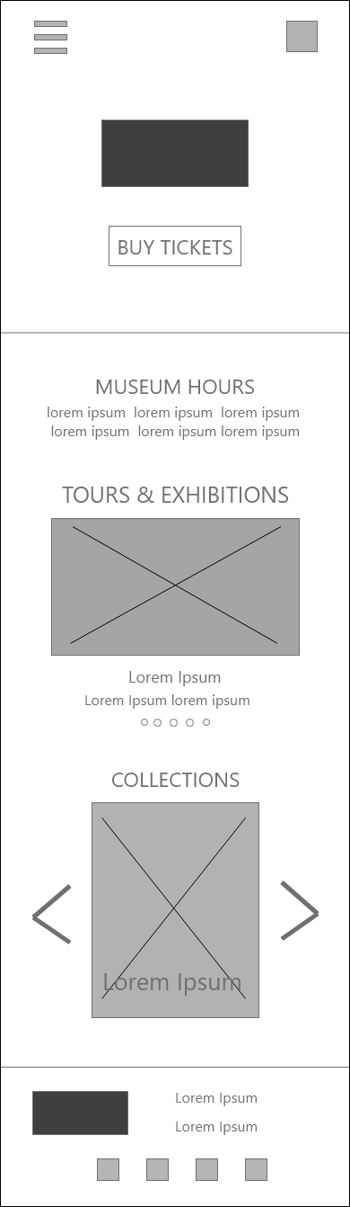
I also created digital wireframes for different screen sizes: tablet and mobile. I adjusted the features, sizes and locations considering space availability, interaction environment and user expectations based on the device.
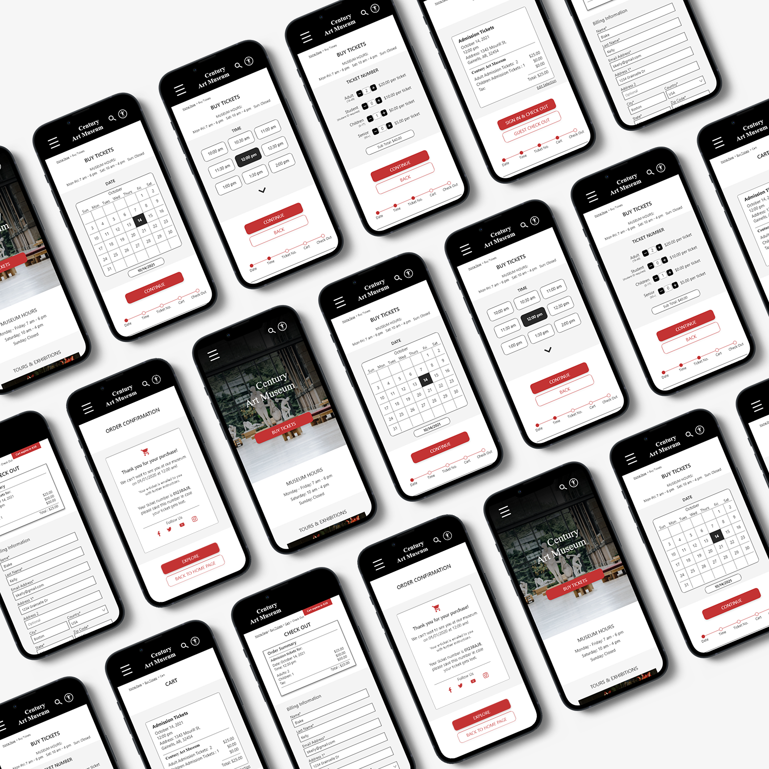
Prototype
The low-fidelity prototype connected the main two user flows in the app and allowed me to start my initial usability tests with users.
*These prototypes are improved versions after the first usability study.
After iterating on the high-fidelity prototype based on peer and user feedback following my second round of testing, I finalized my design. This link shows the final version.
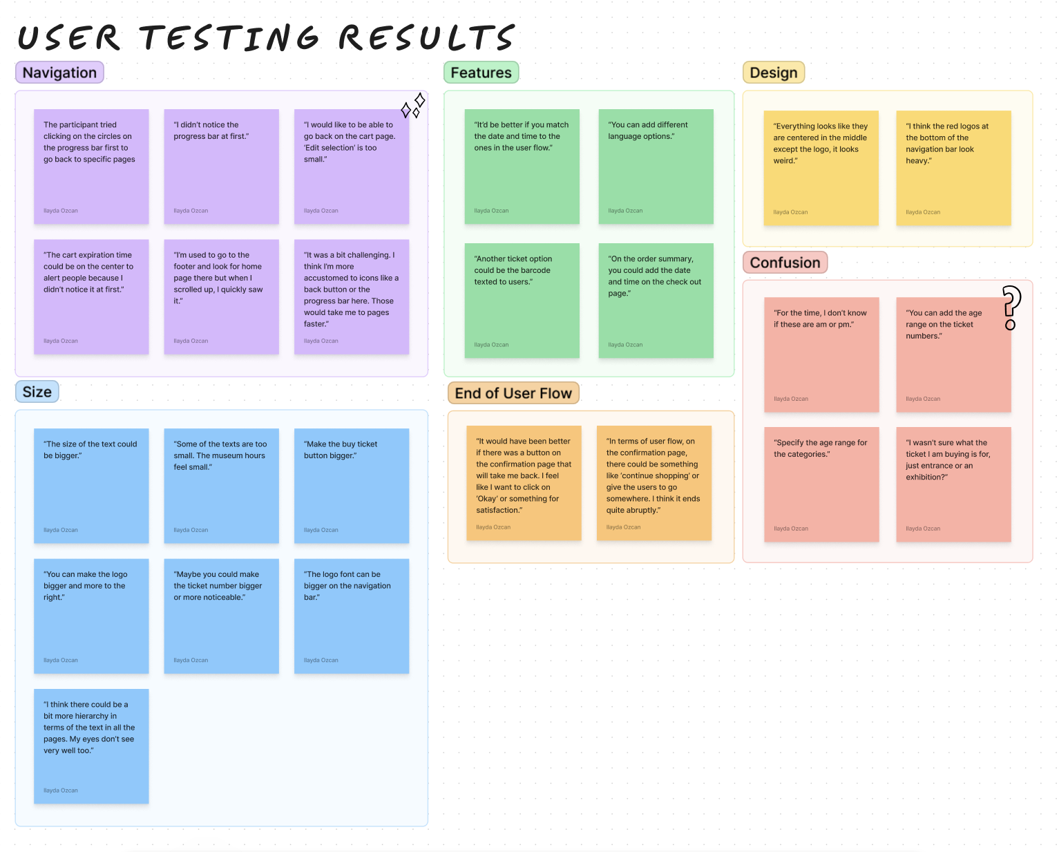
Test
I conducted two rounds of usability studies with low and high fidelity prototypes. I had 10 participants in total from locations such as the USA, Turkey, Belgium, Philippines and Austria.
Round 1 Findings:
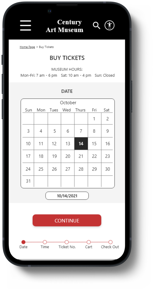
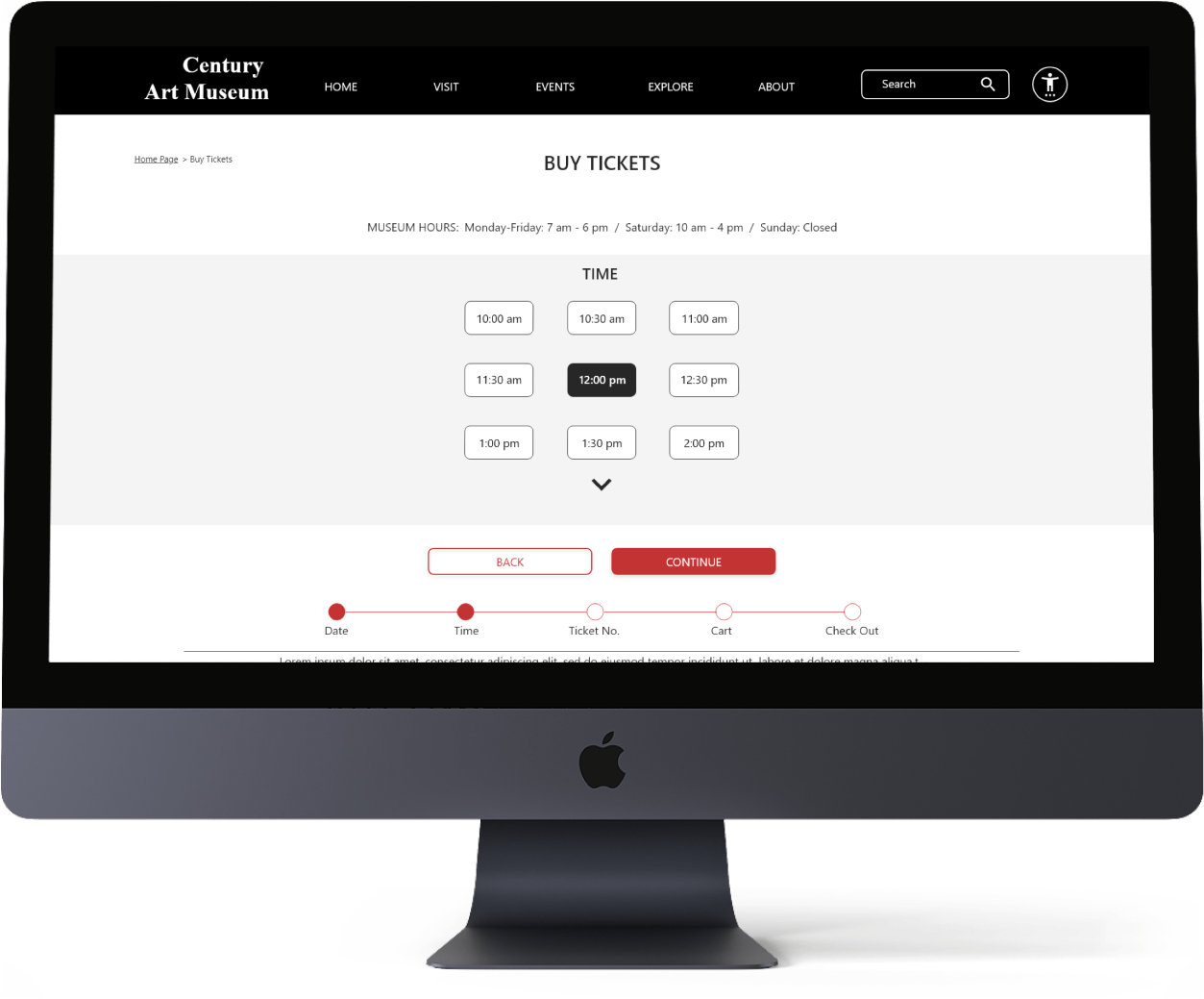
Users prefer if each ticket related selection is on a different page to decrease the cognitive load. Also, to improve navigation, the addition of back buttons are needed.
Round 2 Findings:
It was found that breadcrumbs are not an effective way of navigating back and forth between pages, check out options feel like an extra step because it had its own page, and the ticket selection page has too much information on it.
Accessibility
• Iconography was used. There is a separate ‘Accessibility Settings’ page for users to have easy and quick access to features such as voice-over, text customization etc.
• Hierarchy across pages achieved using headings and landmarks are used to map out the regions of the interface.
• All color combinations in the app passes the WCAG AA and AAA guidelines.
_edited.jpg)
Conclusion
While designing the website, I learned that the first ideas are only the beginning of the process. Usability studies revealed a lot areas where I could improve on the design to make the experience better.
Quote from a participant:
“The website is very clear and minimal unlike other museum website where information feels very condensed.”